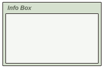
Here’s a useful web design element tutorial on how to create and reuse the ‘Info Panels’ you see throughout my site. (ie, as in the below example)The great thing about this is, when sliced properly and with the right html code manipulation, I can reuse them as much as I want to whatever size I see fit.
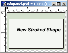
The design is quite simple.
Only three elements used, two shapes and a text element.
Realize the main goal here is to minimize on the amount of graphics to optimize your site.
Realize the main goal here is to minimize on the amount of graphics to optimize your site.
-
So I started off with a document size of 209 x 139.
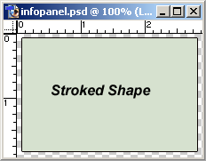
Set the foreground color to your choice (for my site I used #D6E1CF)Then select the Shape Tool (U) from the Toolbar, and choose the ‘Rectangle Shape Tool’, and (hold Shift Key to constrain to proportion) draw in a rectangle as I have captured.Next in the ‘Layers Palette’, right click on that new rectangle shape layer, and choose ‘Blending Modes’. Only check the ‘Stroke Layer Style’.(Size=1,Position=Outside,Blend Mode=Normal,Opacity=100%,Fill Type=Color, Color=(your choice)I used #000000/Black.)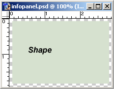
-
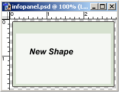
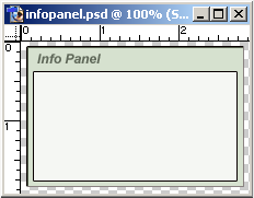
Next set your foreground color to white (Hit the X key on the keyboard).Again select the Shape Tool (U) from the ‘Toolbar’, and choose the ‘Rectangle Shape Tool (U), and draw in (click and drag) the new shape as I have captured. Make sure this layer is uppermost in the layers palette stack, above the previous shape you made.Again, as above, go to the ‘Layers Palette’, right click on that new rectangle shape layer, and choose ‘Blending Modes’. Only check the ‘Stroke Layer Style’.(Size=1,Position=Outside,Blend Mode=Normal,Opacity=100%,Fill Type=Color, Color=(your choice)I used #000000/Black.)TIP: To save yourself that round trip of having to set up that layer style, simple go to layers palette and right click on the previous shape that already has it, and from the menu options, choose, ‘Copy Layer Style’. Then go to your new shape in the layers palette, right click on it and from the menu options, choose, ‘Paste Layer Style’.(Provided you want them to have the exact styles!)
-
Lastly, add a text caption(header) for the info panel.
-
Next, lets begin to slice this Info Panel.
Select the ‘Slice Tool (K)’ from the ‘Toolbar’. Now one thing to note here, also, we’re going to have to zoom in on areas to get just the right slice we need. (Zoom = Ctrl + Plus Sign Key / I used 300% Zoom to slice).I will not walk through each slice, but from the Zoom shot below you can very well see how it’s sliced, and how many I’ve used. A little complex, but necessary, to reuse it as how often I choose on my site.The two important ares are Slice 5 and Slice 11, as they will contain the information areas.
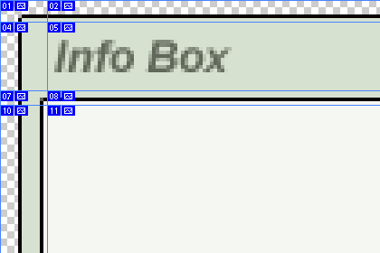
The surrounding slices are even more important as they control how the Panel will actually look once you start adding content.NOTE: For the first slice, turn off Snap (view Snap), then after that one, turn Snap back on and every slice you now make should Snap (line up properly).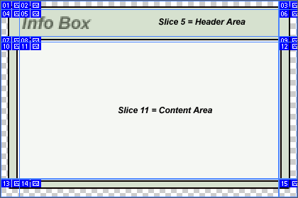 Zoomed in further, now you can really see just how particular this slice is.
TIP: Use the Ctrl + H key to toggle visibility mode of your slices.
-
Next, go to ‘File>Save for the Web’.Verify that your options are the same as mine. I used Transparency mode in my case (optional).
Then hit the ‘Save’ command option. -
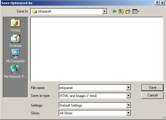
You’ll then be prompted with the ‘Save’ dialogue box, and choose the options I have captured.
Make sure ‘Save As type’ is set to ‘Html and Image (*.html)’.(Also pay attention to the location on your hard drive where this will be saved to.)Then choose the ‘Save’ command option.
-
Ok, now we have the panel designed in Photoshop, and all the necessary .html code generated , lets optimize this thing for reusability.
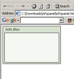
Open the new .html file in your browser, verifying its intact.
Next, lets open this .html file in your favorite editor (I use homesite), and do a cleanup and some tweaking.Below is the actual code for this page, that Photoshop generated.
Here’s the photoshop generated code. -
All I did was took out the meta tag, the comment lines and cleaned up the line breaks.
Here’s what the cleanup code looks like.Now it’s easy to see just how Photoshop did this.
Basically, each Slice occupies a td tag (table data). And if you remember (or view the zoomed final sliced image above), there were three slices going in the horizontal position.(labeled appropriately 1, 2, 3 …) Those three slices(td) occupy a tr (table row), and these tr are grouped inside a single table at a fixed width of 209.(which was the width of our original photoshop document).NOTE: This is actually a simple slice example.From here on it’s strictly html manipulation, to apply content to the panel.
First lets remove that center slice (infopanel_11.gif) and replace it with some text (ie. Info Panel Content will go here.)
Here’s the modified code at this stage.TIP: Use the comment code tags as I did for testing until absolute certain that what your doing works properly, then delete those lines later when it’s ready.Here is what it actually looks like now. -
Next, lets align that new content to the top of the Panel area, by applying a valign=top code inside the td tag that it occupies.
Here’s the modified code at this stage. Here is what it actually looks like now. -
At this point, you’d think your ready to use this as is, on your site.
Actually, no!To prove my point lets, suppose the actual content in the panel exceeds the width and length of it’s surrounding images? (This could be a new image or text.)
Well have a look at the next 2 links, and you’ll see what I mean.Here’s the modified code at this stage. Here is what it actually looks like now.Exactly, a mess!For the modified code, all i did was add new text without a break on the first line and multiple line breaks thereafter.
Just a few html tweaks will fix this. -
To fix this, it’s almost instantly easy to see what to do. Obviously the left and right images need to shift to the top.
So thats the first answer, apply valign=top to the two td tags in which those images occupy.(ie left image= infopanel_10.gif and right image= infopanel_12.gif)
Here’s the modified code at this stage. Here is what it actually looks like now.Thats a little better, theres still some elements to fill in though. -
Next I’ll fill those same td tags background area with the very images that occupy it.
Here’s the modified code at this stage. Here is what it actually looks like now.Thats much better. We’re almost there. -
Apply the same td background fill to the bottom.(ie, the td that contains infopanel_14.gif)
Here’s the modified code at this stage. Here is what it actually looks like now.
Almost complete! -
What remains is the top empty bg area. We’ll apply the same background trick where infopanel_02.gif & infopanel_08.gif resides and a background color to infopanel_05.gif td.
Here’s the modified code at this stage. Here is what it actually looks like now.Just the way we wanted it. -
Now add real content and also try altering the original table width beyond the 209.
Here’s the modified code at this stage.
That wraps up this tutorial. There are other thing to reconsider, like replacing image infopanel_05.gif (Info Panel header) with real text when considering reusing the panel elsewhere. The great thing about this is, when sliced properly and with the right html code manipulation, I can reuse them as much as I want to whatever size I see fit.